To create a short film in its entirety, lasting approximately 5 minutes, which may be live action or animated or a combination of both, together with two of the following three options:
- a poster for the film
- a radio trailer for the film
- a film magazine review page featuring the film
First of all, we discussed our Target Audience, and then we designed our posters accordingly. We thought that we probably had four different target audience's.
1. Middle-ages men and women because of our plot. There is a married couple, life insurance and the 1950's style is very popular in Fashion today. This is the sketch idea for our first poster:
In this poster, Evelyn and Jack embrace, Evelyn is looking at Jack who is looking at her but there is no physical contact between them. James is looking at Evelyn but holding Sarah's hand, who is looking at James. Jack and James would be in suits while Evelyn would be in red and Sarah in her waitress outfit.
Our second target audience would probably be Crime Drama Fans as there are guns, money, sex, police in our film and the plot is a crime unfolding/crime investigation. In this poster we would have Jack in the middle, holding a cigarette and a note pad. He would be looking at the note pad or at the camera. Evelyn would be looking at Jack but holding James. We would also have a shot on the other side of Harry interviewing Sarah.
We thought that these two first idea's would be best for us as individual posters for our coursework as they are very similar in layout yet quiet different positioning and camera work.
We also though that another target audience could be Film Noir enthusiasts. This is because it has elements of both Film noir and Neo noir! Therefore, this poster would be in black and white. However, we decided that this was probably our worst design and so decided not to use it.
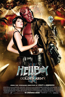
Lastly, we thought that our target audience would also include teenagers. This is because there are teenage actors and producers, it is a thriller/crime genre and there is a love triangle, which is very popular in teen-movies at the moment. Therefore, for this poster, which we will be producing together as it is our best idea, will have influence from several other existing movie posters. For example, 'Becoming Jane', 'Wild Bill' and 'Hell Boy' have all influenced this poster design.
In this poster, we would have Evelyn looking at the camera in Femme Fatal way, and Jack looking at Evelyn with love. A little like the 'Becoming Jane' poster:Harry would be looking mean and straight at the camera. Like this 'Wild Bill' poster:
James and Sarah would be positioned like the 'Hellboy' poster, looking in the same direction:
We think that these posters will cover our Target Audience, and having 3 different posters will be more realistic, as most movies have different posters to appeal to different people who appreciate different aspects of the movie itself. Therefore, we are sticking with usual movie production protocol.


No comments:
Post a Comment